Why?
I was in a personal rut, and just needed to ship a quick, small project that I could show off and feel like I “completed” even if I never went back to it again. It fit with my language learning goals and nostalgia for board games to make it the game that it was.
Relevant contributions
- Product design
- Graphics & animation
- Wireframes & mockups
- Frontend development
Major tools
Frontend:
- Vanilla JS
- HTML
- SVG
- CSS
Creative:
- Plain paper & pen
- Adobe Illustrator
- Adobe XD
Process
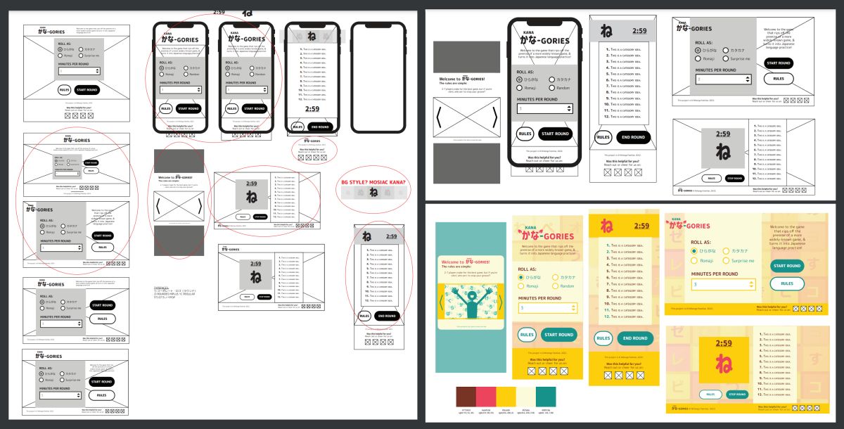
I already had the game idea I wanted to try via an epiphany moment. The rest of planning was about refinement for the purpose of language learning. It also needed to be as simple as possible because I wanted this project to be short & sweet. Here is how it went~
- I started off researching similar games & postulating how I could convert for a language study experience.
-
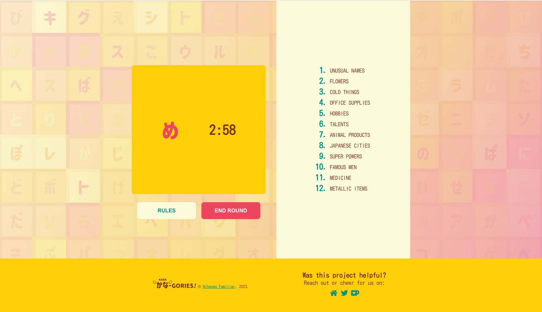
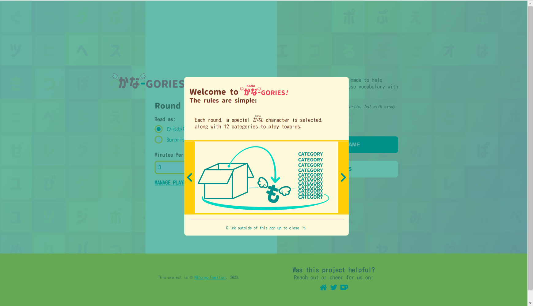
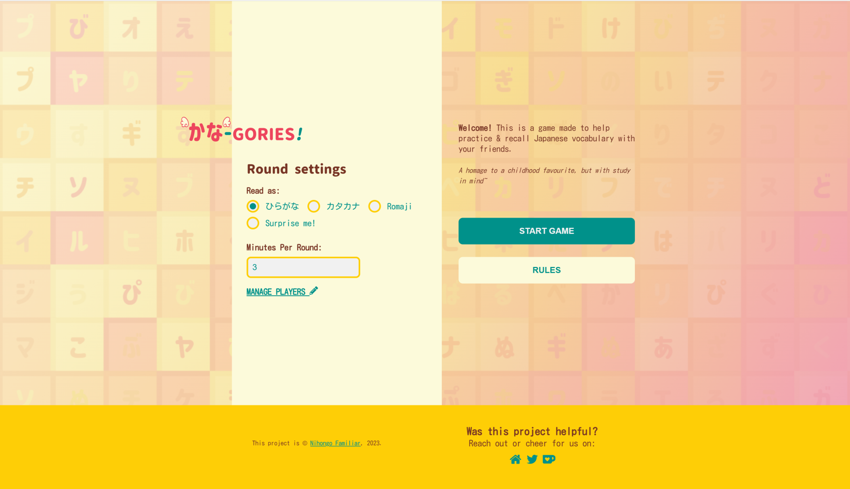
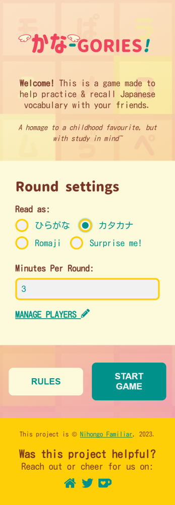
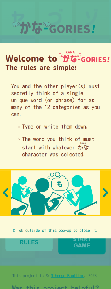
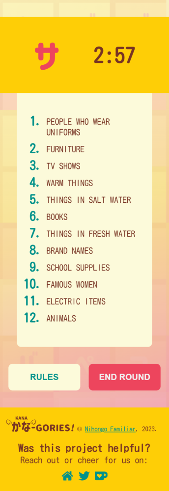
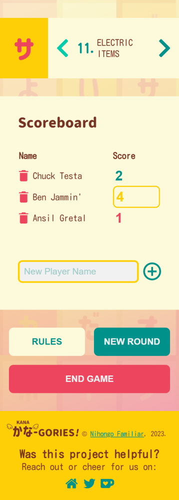
I planned out 3 basic screens/sections that would matter most for the MVP:
- Rules
- Settings
- he game itself (which is just data and a timer)
- I wireframed ideas for the screen layouts on mobile & desktop.
- I designed mockups for the screens. I wasn't sure about color schemes yet, so it was all in greyscale.
- I coded the screens based on the mockups.
- Made the first releases, & got feedback to iterate on.
Hurdles
-
Figuring out a colour scheme for the project.
- Usually I do design up-front, but for whatever reason, this game me trouble.
- I eventually got there with 3 days of mood boarding & fretting.
- The deciding factor was just going with my gut & not looking back
What would I improve?
-
Better accessibility.
- Specifically, for tabbing fixes.
- More broadly, any improvements in general.
- Based on feedback, support for different learning levels.
