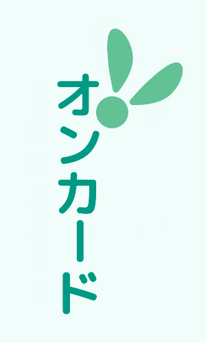
Onkaado
This logo was made for a Japanese language study game.
The only major requirement for it was to have a fairy in refrence to the not-yet designed mascot of the game.
The logo would be used as a blueprint for said mascot.
For the fairy look in the logomark, I drew a lot of inspiration from mayflies & butterflies.
The goal was to try and simplify an idea of a fairy as much as possible and use aspects of flat
design to give a polished and more reverent nod to the functional minimalism of classic 8-bit games.
The typefaces used in the logo were chosen to reflect a world with a more modernized impression of classical magic;
one where technological & digital advancements are included in the roster with incantation & ritual because
of how they profound may seem & how methodically pretty they can be refined. This was intended to go hand-in-hand
with the scholarly aspect of the application it was made to represent.
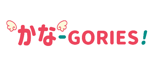
Kana-gories!
This logo was made for a Japanese language study game. The goal was to make something simple, cute, and light. The result was a logo that was text-heavy, but leveraged color and animation to emphasize the lightheartedness of it as a simple game and focus on the topic of Japanese language.
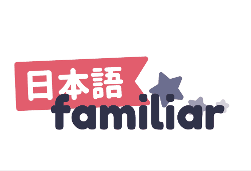
Nihongo Familiar
This logo was made for a Japanese language learning blog. It takes inspiration in part from "tanzaku", a paper used to write hopes and wishes during the Japanese holiday Tanabata and koinobori, carp shaped windsocks used during Japan's Children's Day. The intended vibe of the logo was to provide a bit of low-key cheering and fanfare for people working hard to learn and grow during their Japanese studies.
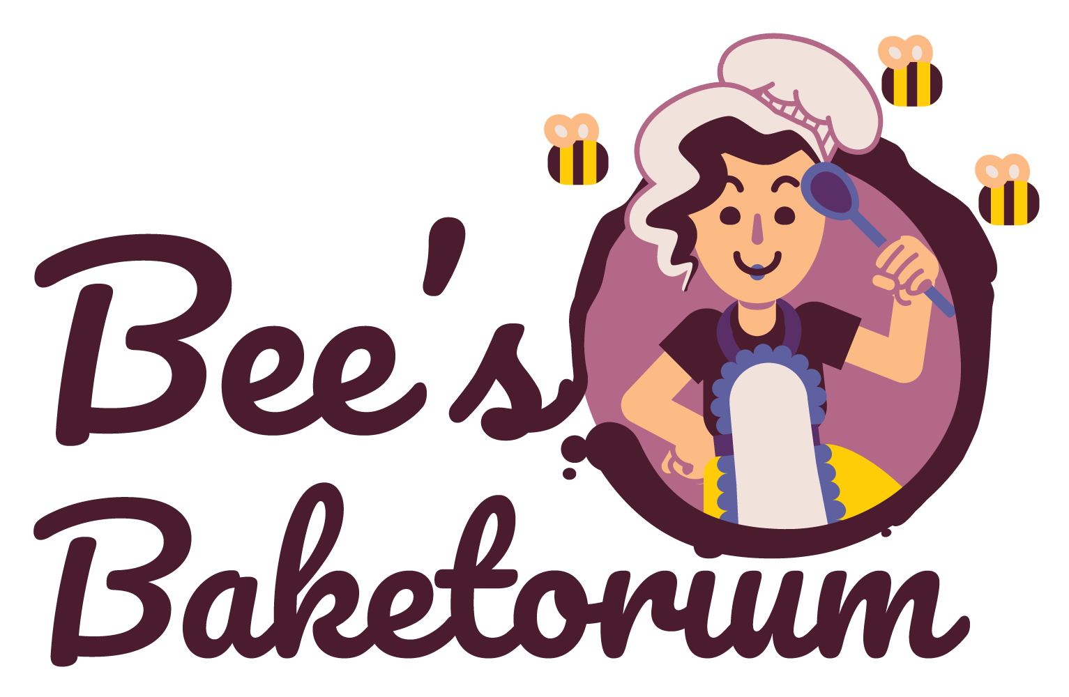
Bee's Baketorium
A cute little logo featuring the head pâtissier in a
small bakery operation!
My client requested that I added a lot of bees, and damn it, that was 100%
aligned with things I love to do!
For this particular project, I worked directly with the client
in an iterative approach in order to reach the logo of her dreams.
I am especially pleased with this one because flat design rarely
uses a smear & splatter effects. You could say that was the cherry on top for me~
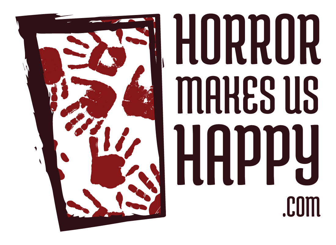
Horror Makes Us Happy .com
A logo submitted for a podcast, it ended up being accepted among the logos intended for use in stickers and other print collateral. They wanted something classy, but horror inspired.
Connechub
This is logo for a video classifieds web app. Connechub needed a logo to kickstart the emerging designs of their company. I worked directly with their team to create the logo that suited their brand's vision.

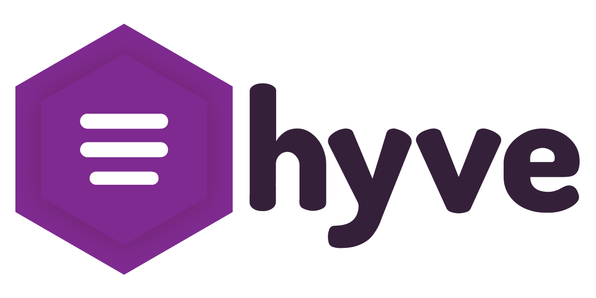
hyve
Working alongside David Castaneda on StartupBus 2019,
we created the logo for an email security company.
My contribution initially focused on the typeface used for the logo,
but after some time and internal changes for the team, I was tasked to
updated the logomark in minor ways to better reflect the company's
changes in design needs.
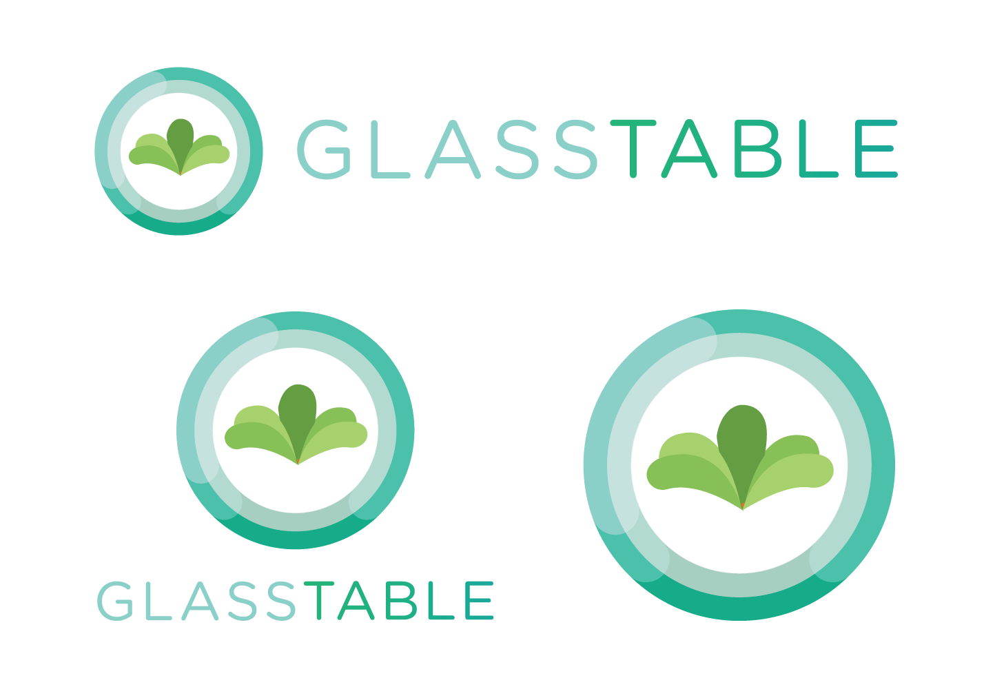
Glass Table
Working alongside James Blevins, we created the logo design for this
startup during a StartupBus competition. My contribution focused on
the logomark of the design, as well as the color scheme.
We created horizontal, vertical, and black-and-white iterations of the logo.
TimeWhiz
This is a logo I put together for a web development project I worked on
to learn the MEAN stack. Initially this was part of an inappropriate inside
joke with a colleague about timing your own bathroom breaks.
The application's name was a blatant pun, and the logo works with that.

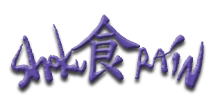
Shoku食Rain
This is a logo I made for a cute web game I put together for fun
using the Wanikani API. I had fun with it, and it was one of
my earliest logo works. I have learned a lot since then, and
use a lot more vector tools now.
If I were to remake this logo, I would probably convert it to
a flat design. I'd probably change the look of the kanji to
fit the rest of it more.
The Kana ContrAPPtion
Logo for a Japanese language learning mini-game I was making
for the Windows Phone! The project never made it to production,
but the logo was kind of cute.
It was one of the earliest, if not the first, of my logo works.