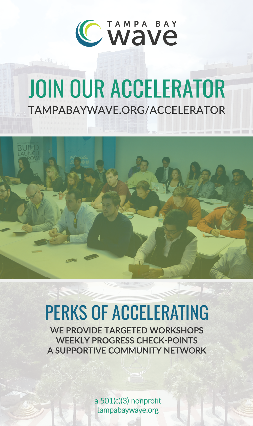
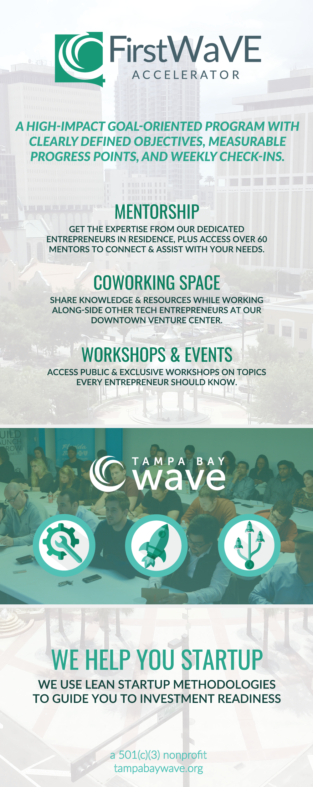
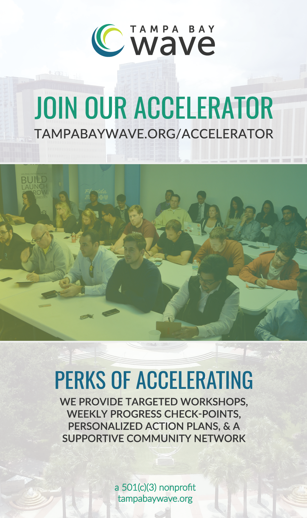
Banner stands
This was a set of 3 banner stands that we got printed to bring to events. The tallest one was taller than me once they were all printed. Amazing— at least from my perspective!
They took a lot of my computer's processing power and space, unfortunately. So it took hours to get these bad boys exported for the printers.
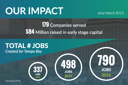
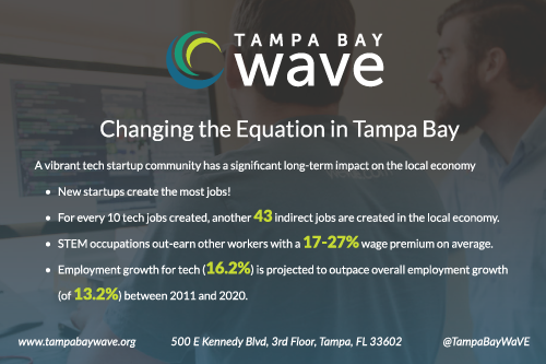
Metrics postcard
This was a cute, little postcard sized flyer that displayed some quick metrics about WaVE at the time. This was made near the end of my term at the company, and marked the start of a shift in design/brand changes we were moving toward. It looks even more slick and modern~
Conference room signs
In contrast to the metrics flyer, these little signs were some of the earliest things I designed at WaVE. I was requested to make quirky stickers to help people work around the fact that the conference room doors needed to be pushed open with pull-handles.
Our Operations Manager at the time really wanted to reference the Salt-N-Pepa song, and the other one was to be some kind of innuendo. If it is not completely obvious at this point, my early days with WaVE had a completely different vibe when I started there than by the time I left. That isn't a bad or a good thing— more so an interesting thing I noticed as I was posting this.

