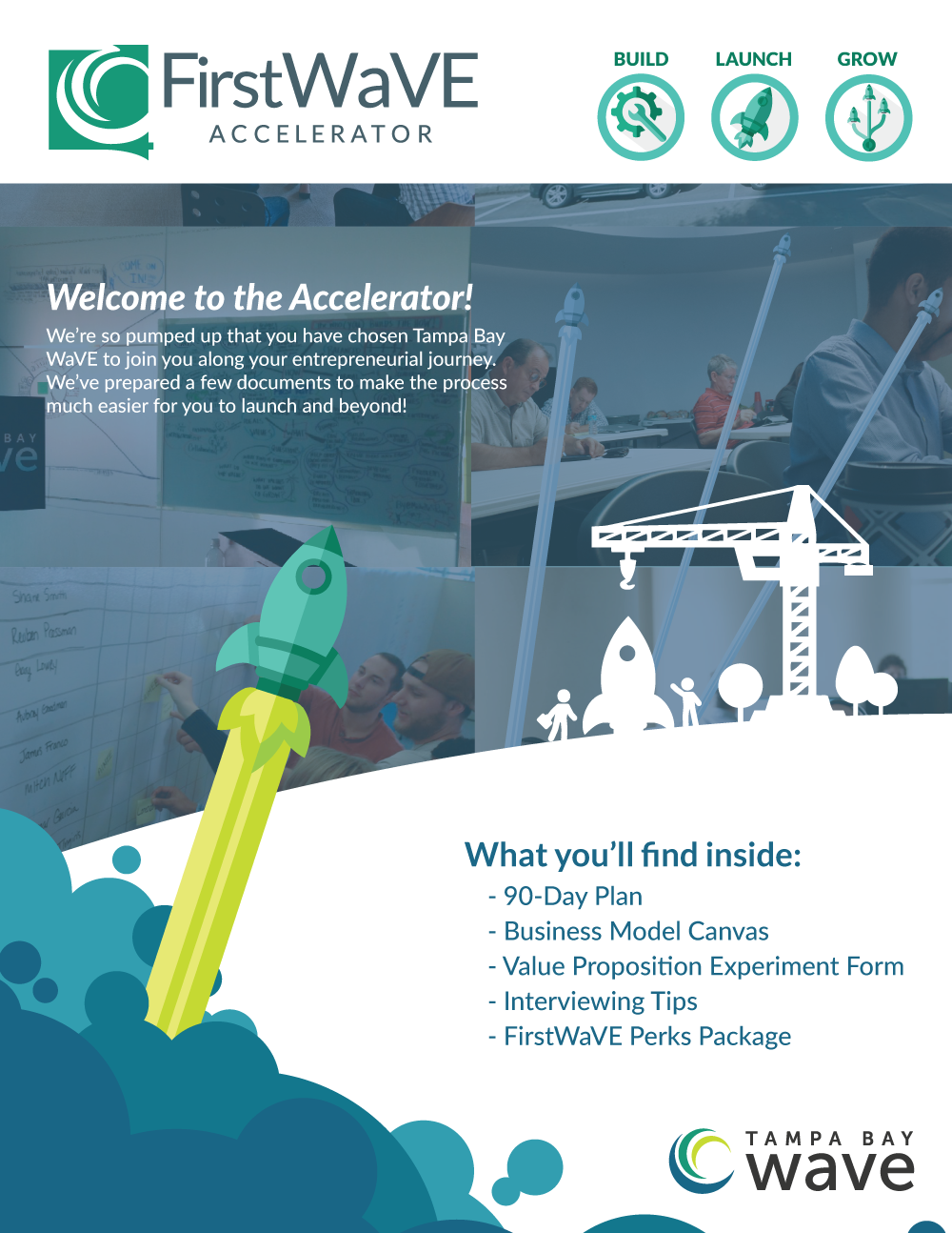
Why?
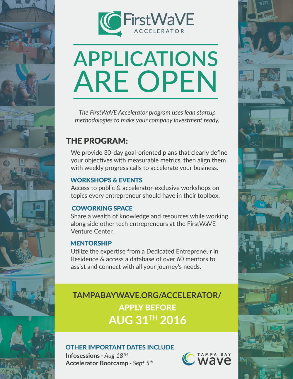
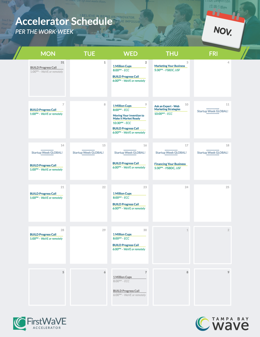
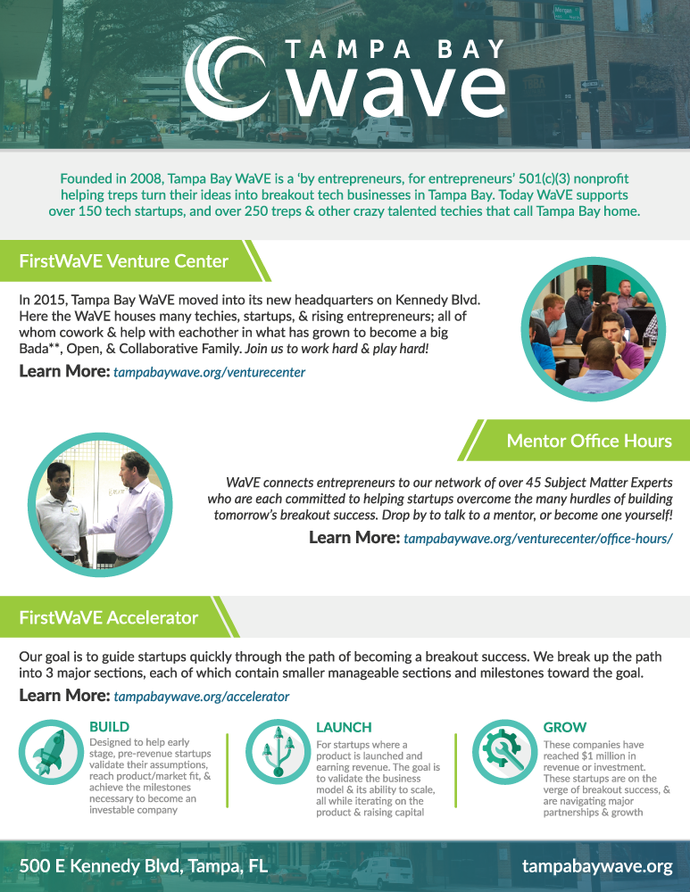
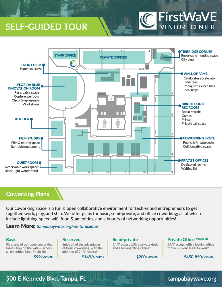
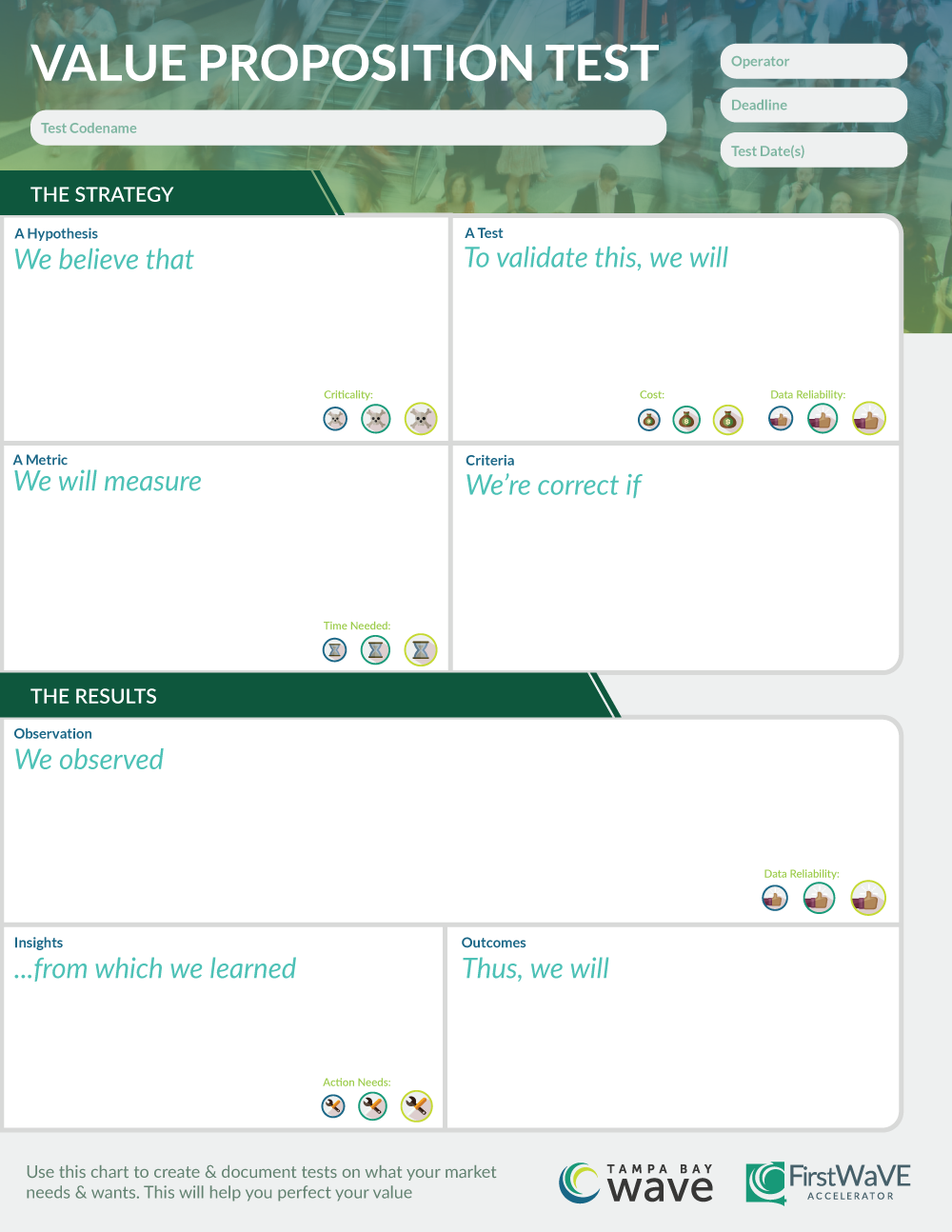
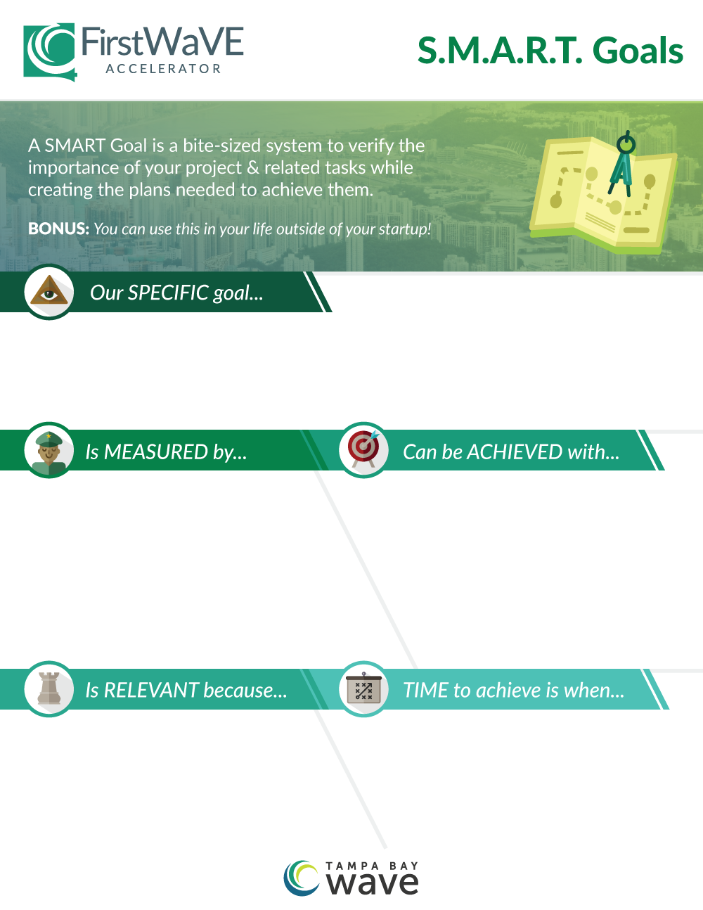
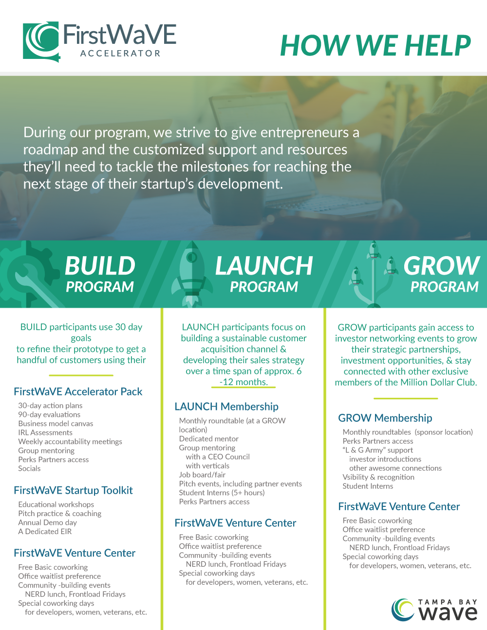
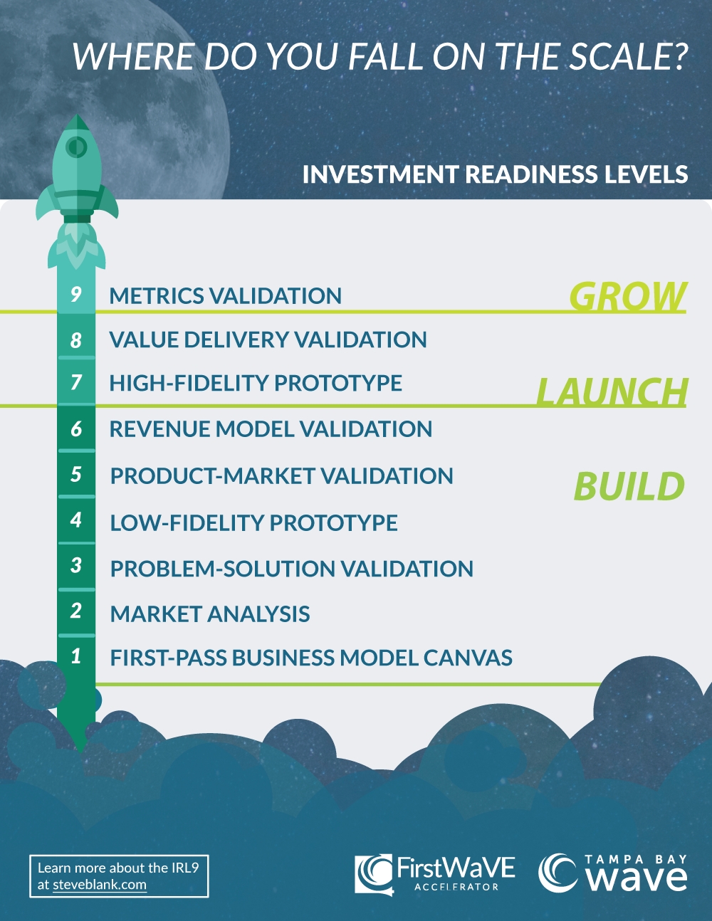
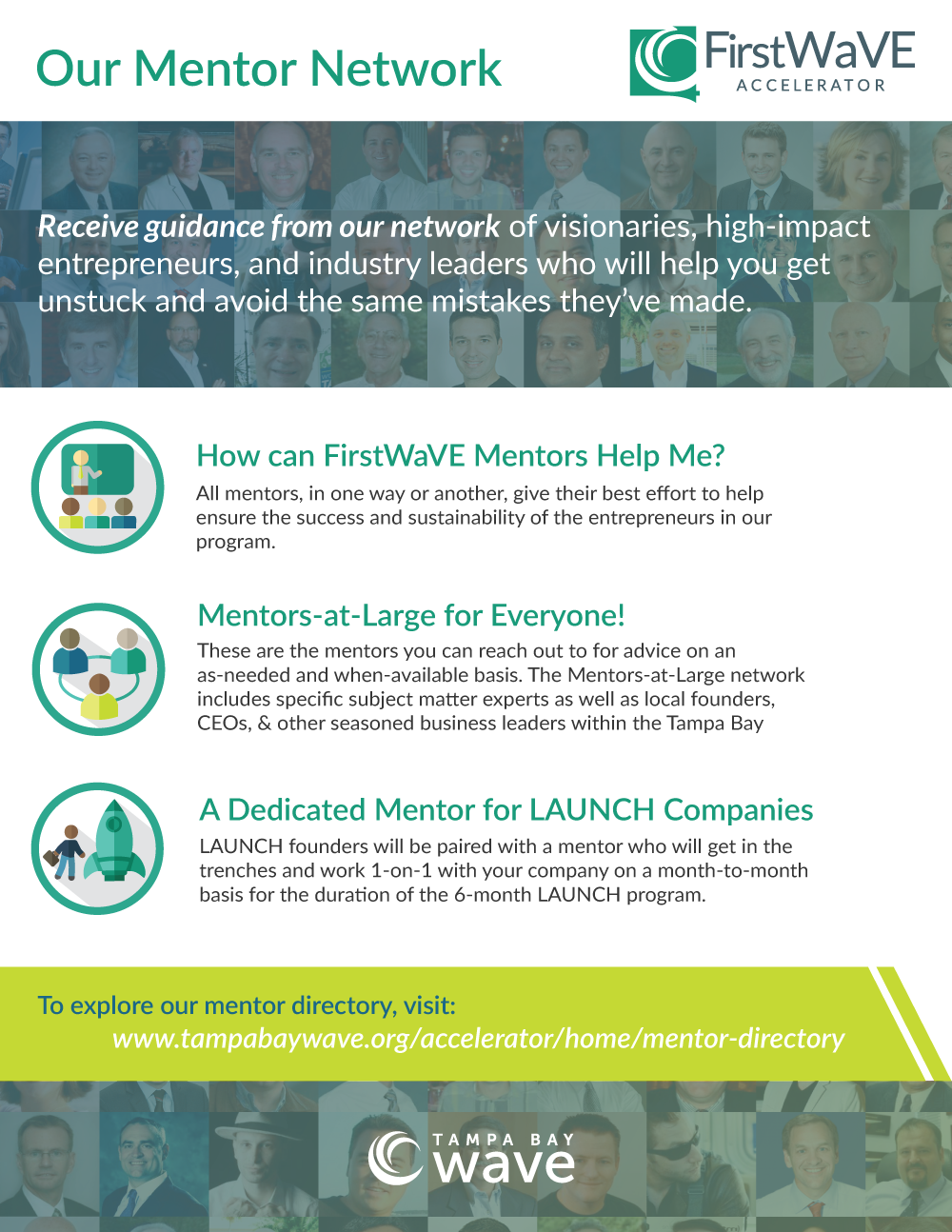
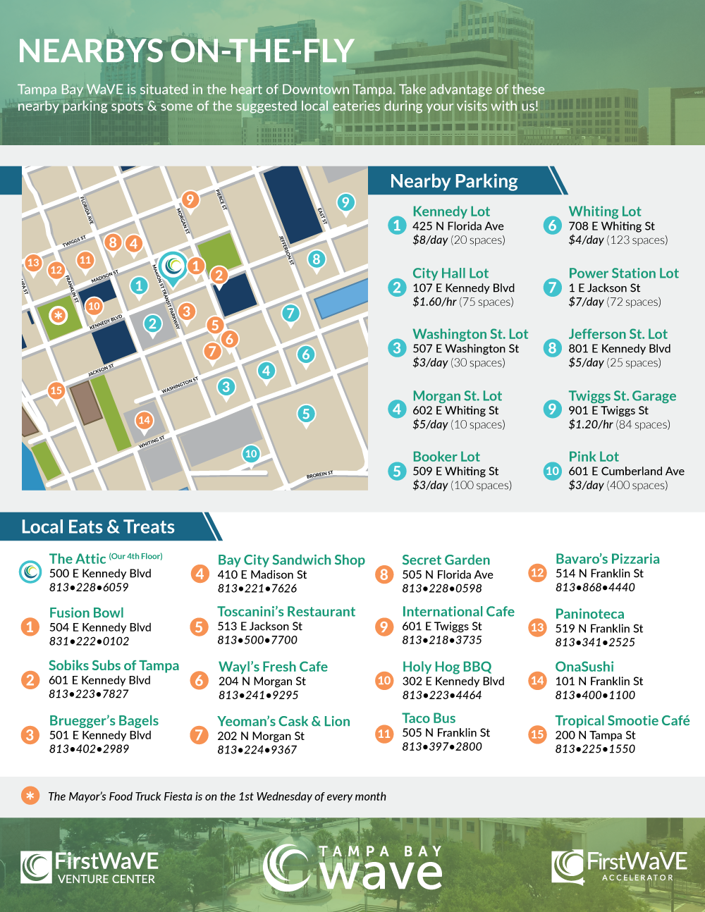
At the time this was made, I worked with the current Accelerator Manager to plan and create this. Much of the program's focus at the time was targeted at Launch and Grow levels of the program. He wanted to add some extra support for the Build level.
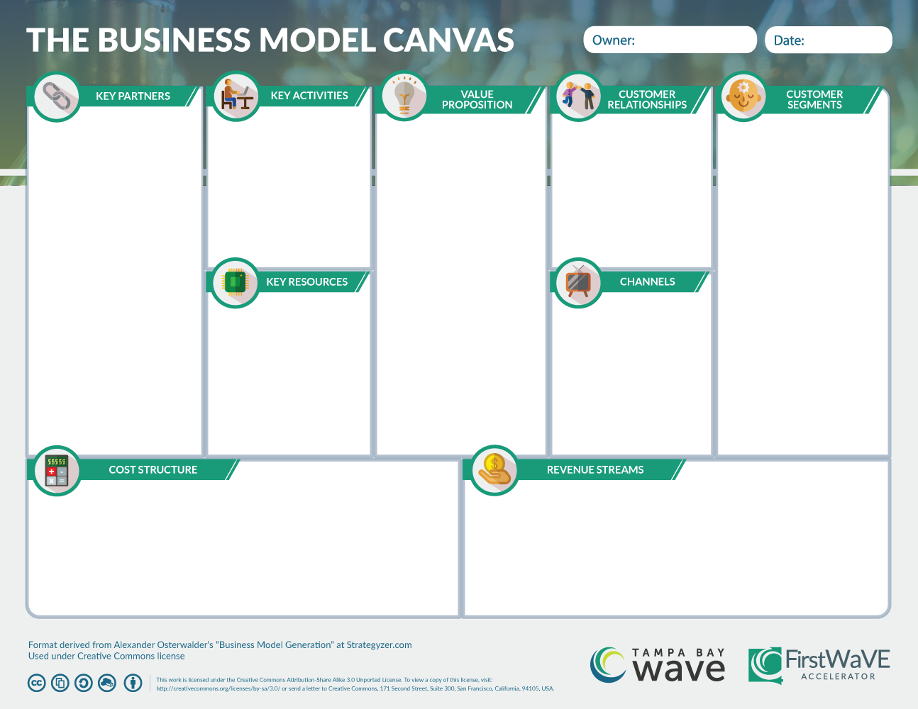
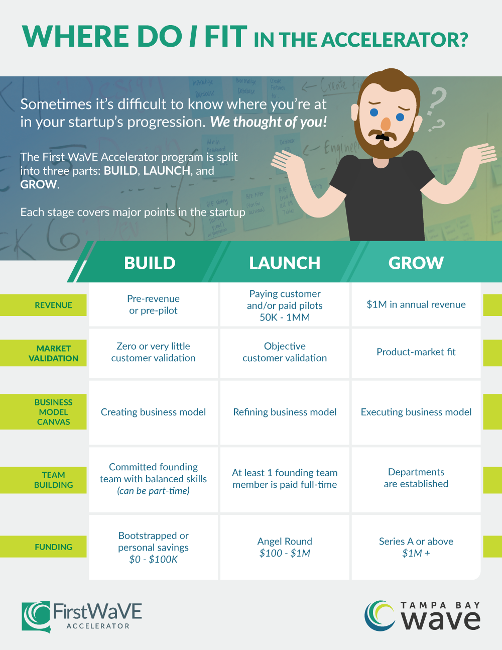
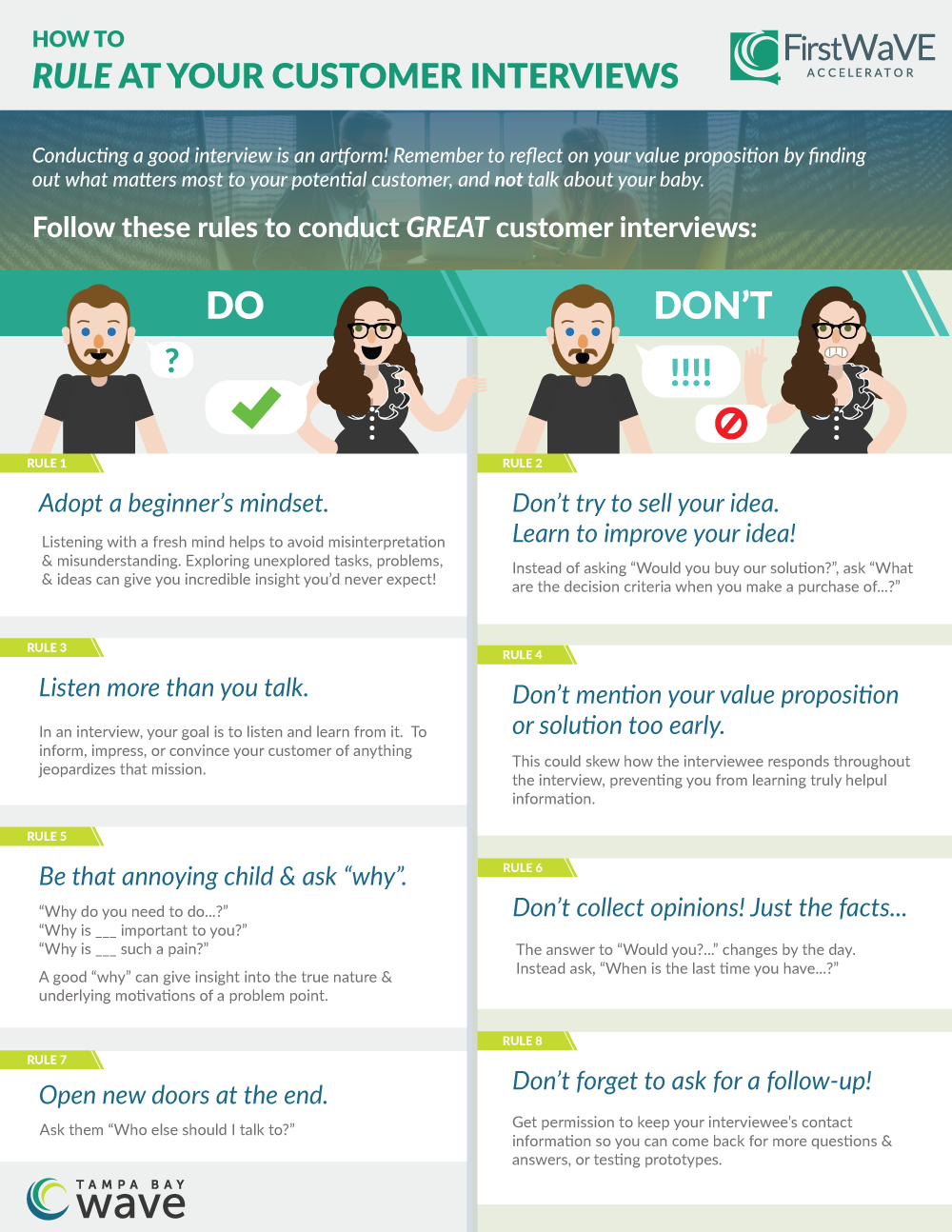
Hurdles
Not long after this project was completed, there were some internal changes at the team level and leadership in the company. This project ended up being foregone, with only a few pieces of collateral being repurposed for later. In my opinion, it was a great loss— but I may be biased.
Lessons
I had a great time with this, and would love to do something like this again! Here are my major takeaways from this project:
- It was a great exercise in seeing how many variations in layout and on-brand color schemes I could apply without the booklet getting too crazy or lost in monotony.
- I got to create a lot of character art in vectors, which is something I rarely had opportunities to do before at work.
-
I got to work on something directly useful for the learning experience of accelerator program participants.
- It was a rare & special thing for me, since most of my in-house designs were for advertising and signage.
